Katsuhiro Otomo uses this one trick so well that it’s baffling others haven’t made it a comic book staple like speed lines, excessive exclamation marks and pointy shocked speech balloons. Perhaps it is merely because he employs it so deftly as to be almost undetectable until your right in the thick of it.
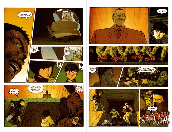
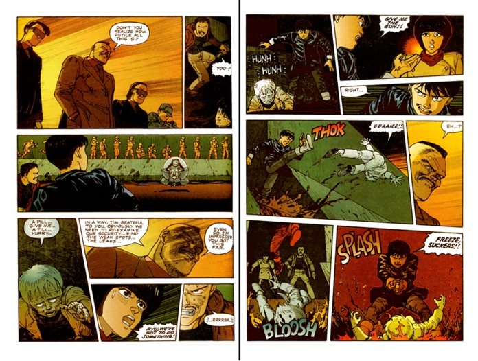
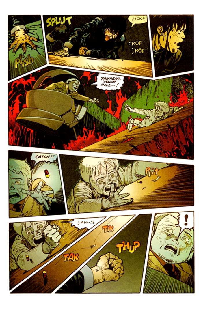
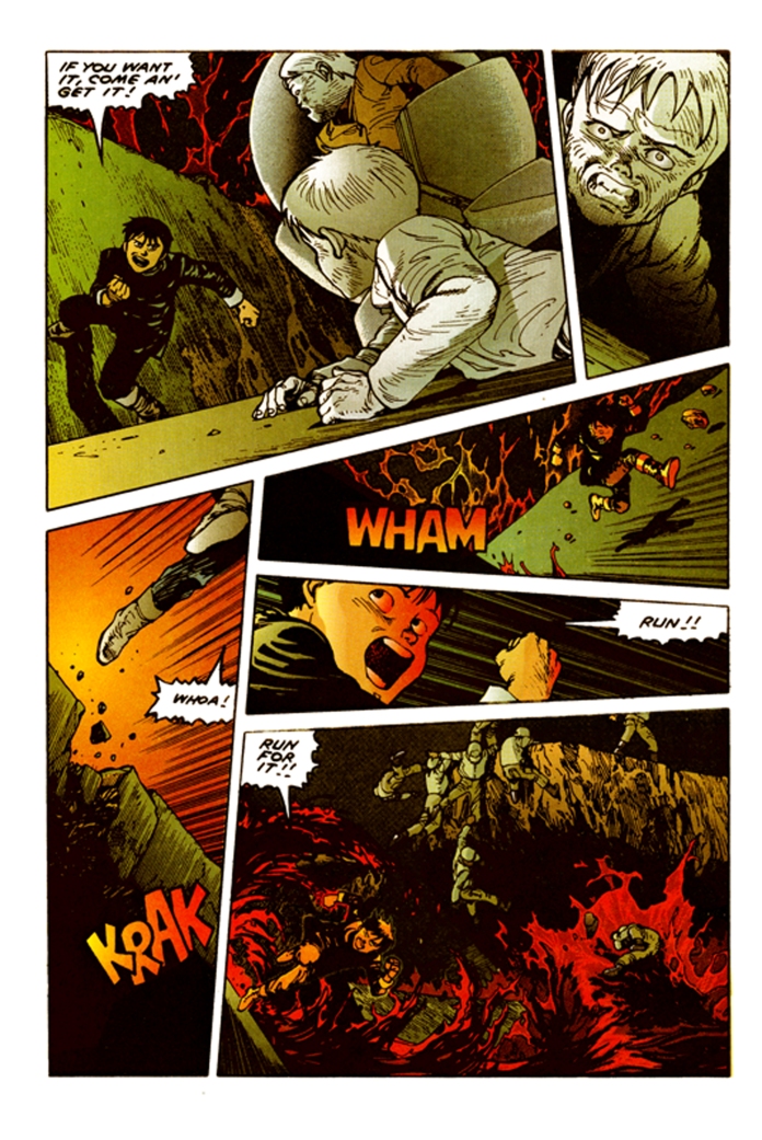
It’s this simple: when the action is relatively static and just talky, the page layout is rigidly perpendicular (aka standard). When action is rising (remember your eighth grade literature class charts?), the horizontals start to slide and slant ever so slightly. And when the climax arrives, the tiers are about as level as the slides at a water park. Chaos is reigning and that ratchets up the energy and your reading speed! However, Otomo is always careful to be sure it does nothing to confuse your reading of the page. The tilts become the shifting of the characters’ weights, the moving center of gravity of a dance, and the read is actually enhanced. Have a look:
Now that’s awesome! Notice how at first he just slants the verticals to enhance the intensity of a character’s gaze? Check out the directions of everyone’s eye-lines on the first two pages. The “he’s looking here but I’m looking there while she’s looking right and they’re running left” quality just enhances the overall bedlam of the scene. You can see this pot is about to boil! When I was in Japan, I had a very long and fascinating conversation with Naoki Urasawa, the creator of Monster!, about Otomo’s use of his character’s gaze. Urasawa found this usage, leading the reader across the page from panel to panel, very Western. He cited this as further example that Otomo was affected to the core by European and American comics and film, not just in the superficial trappings of his style (which obviously owes much to Frenchman Jean “Moebius” Giraud.) By contrast, he showed me that most homegrown manga had the character’s eyes always facing out towards the viewer. He attributed this to the filmic style of Yasujiro Ozu, director of Tokyo Story. He said it was Ozu’s belief that the character should not avoid looking at the camera, but rather face it directly. The camera is always the first-person subjective point-of-view, he claimed, and therefore the characters should address it as a means of telling their stories directly to the viewer.
Be that as it may, I think traitorous Otomo nails the tension of this scene by opting for the every-which-way approach. You can feel how surrounded everyone is, so when Kaneda finally breaks the crisscrossed tension with a beautiful frozen profile kick in a nice long trapezoidal panel, you welcome the catharsis to come that will release you from this fever pitch suspense. And come it does with Otomo’s brilliant command of his angular panels. I trimmed a page or two in which the whole place starts to collapse, but you can see that just from the pitched “rooftop” of the panel in which the floating wheelchair kid reaches desperately for his friend. That page finishes in perfect angled fan slices that emphasize the action of the bouncing pill. And the final page is the most dexterous, with Kaneda nearly pushing his weight off the side of the panel itself to spring to safety. Notice how his push is always from the left, his run to the right throughout the whole page. Again, the tilts are brilliantly employed to suggest his changing balance in this cat-like escape.


