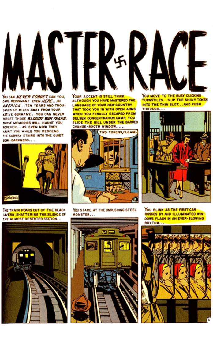
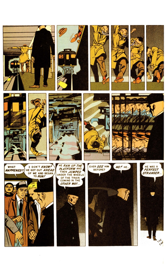
I’m really not interested in getting into story elements here, as my concern is not with the plot itself but rather how it is constructed, but I do not feel I can post a story titled “Master Race” with a prominent swastika in the logo without some sort of explanation. This story was suggested and edited by Al Feldstein and illustrated by Bernard Krigstein, both of whom are Jewish. It follows a seemingly banal wait for a subway by a concentration camp survivor — only to reveal that this survivor was the camp commandant who has gone unpunished. A former victim of the same camp (Maus author Art Spiegelman smartly suggests he could merely be a specter) recognizes him and leads him to his just reward. All of this makes for a gripping read, but in the hands of any other EC artist would have come off as completely ham-fisted like much of their horror output. Krigstein makes this into operatic High Art. It is baffling to me that something this innovative could have come out in 1955 and yet we are still waiting for artists to catch up to his numerous tricks. Observe all those used in just the first and last pages of this seminal work:
The brilliance of execution here is staggering. This is artistry comparable to our greatest novellas: just as every sentence in Joseph Conrad’s Heart of Darkness can be taken literally, figuratively, allegorically, etc., so is every shot here chosen for a physical motion and a metaphoric truth. The man who will die is first shown descending into a darkened subway as if it is the underworld. The subway platform becomes his own private death trap, with bars and gates like the camp he ran.
But of course, the real innovation here is the last panel on the first page: he shows the speed of the subway by expertly quadrupling and octupling his drawing of the passing figures WITHOUT GUTTER BREAKS! This repetition is all done within a single panel, suggesting the simultaneous ghost images we see when we rapidly fan our hands or observe a spinning propeller. By leaving out the gutters, we are given the impression that time has not been segmented; we are not observing distinct moments in time but rather a single snapshot of intense speed. The fact that the woman multiplied wears a traditionally Jewish head scarf suggests a metaphoric reading of how his guilt is intensified on an everyday basis: he freezes and repeats the faces of those who resemble his numerous victims. They will not leave the frame but stretch to fill it.
The last page employs a new action trick. As the main character runs from his haunter, he slips. Any other artist would have chosen to show that as a one-two panel punch, emphasizing the speed of his fatal mistake. Krigstein stretches that slip to a ruthless ten panels, including an excruciating row of evenly sized four panels depicting every movement in his fall with the anatomical accuracy of key frames of animation. The effect is the slow motion action examination employed frequently by John Woo, imitated by the Wachowski bros., done to death by Zack Snyder, but the purpose is not to emphasize the “coolness” of the action, but the awfulness. This once absolutely powerful and terrible man of the Reich (his name is Reissman, by the way) does not deserve the fabled fiddling fall of their admired Rome; he literally falls as a broken, enfeebled old man. The fall continues on the next tier in same-shaped panels, now brilliantly intercut with the unavoidable approaching train. Without a single sound effect, we feel the pitiless impact as the train enacts the revenge the Allies could not. The rush and roar of the train is accomplished by the return of the fan effect, but this time it is employed to metaphorically multiply the faces of those who pass this final judgment upon him. The former victim, perhaps imagined torturer, utters the appropriately frigid last lines and fades into the darkness of the frameless last panel.
The moral lesson here is crystal clear. The artistic one should be emphasized: add panels to slow actions down; remove frames to speed time up. Look again at how mercilessly slow the proceedings are on the last page due to the segmentation, only to have the hit rush by at a thousand miles an hour by using the reverse technique. His demise is endless. His death — instant. These tricks work beautifully on their own, but Krigstein practically invented both here and used them in concert to pull off a manipulation of time I have yet to see bested.


Keen observations on one of comics’ finest theorists. I knew Bernie Krigstein in the four years prior to his passing, and am honored to have made his acquaintance and to have spoken many, many times about art, high, low, and in between, and to have had his input for my own work. He was a great innovator in comics; as a painter he tread in that twilight realm somewhere between late Claude Monet (Impressionism) and early Wassily Kandinsky (Expressionism), using occasionally Fauvist colors. Yes, he was a thoughtful explorer on canvas as well as in panels. It’s a great loss to us that Krigstein isn’t here to push the boundaries of the graphic novel medium we have today, one which he sought to embark upon in the early 1960s with a few rough layouts for a full-length adaptation of Stephen Crane’s THE RED BAD OF COURAGE. Sadly, no publisher would touch it then. He was simply too far ahead of the curve.
Excellent choice of Krigstein art to analyze. We need to go back and dig up some more of his EC appearances.
Pingback: Comic Books as High Art | Scott Andrew Hutchins